A Sherwin-Williams survey of more than 1,200 homeowners found that 44% said a single accent wall is the most effective way to make a space stand out. If you have been researching interior house painting in Surfside, SC, that statistic explains why two-tone wall color ideas now dominate so many conversations with painters. It also explains why projects stall mid-stream. The first color feels settled. The second one turns into a week of second-guessing.
This happens to homeowners with strong design instincts, not beginners. The reason has nothing to do with taste.

Why the Second Color Trips Up So Many Homeowners
Paint catalogs list over 3,500 options at Benjamin Moore alone. Sherwin-Williams adds more than 1,700 of its own. This is not a shortage problem. It is an abundance problem, and it hits the second wall color harder than the first.
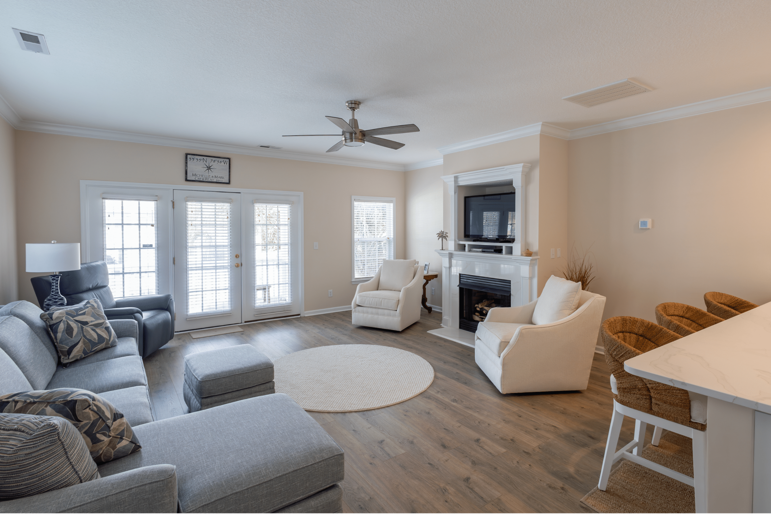
Here is what tends to happen during interior house painting in Surfside, SC. You pick your main color because you already have an anchor for it. Maybe a fabric in your home, a shade from a trip, or a color that feels right. The second wall color carries no such reference. It has to make the first color sing. It has to read well under your specific coastal light. It cannot fight with the floors or trim you already own. On top of all that, it has to look good on its own.
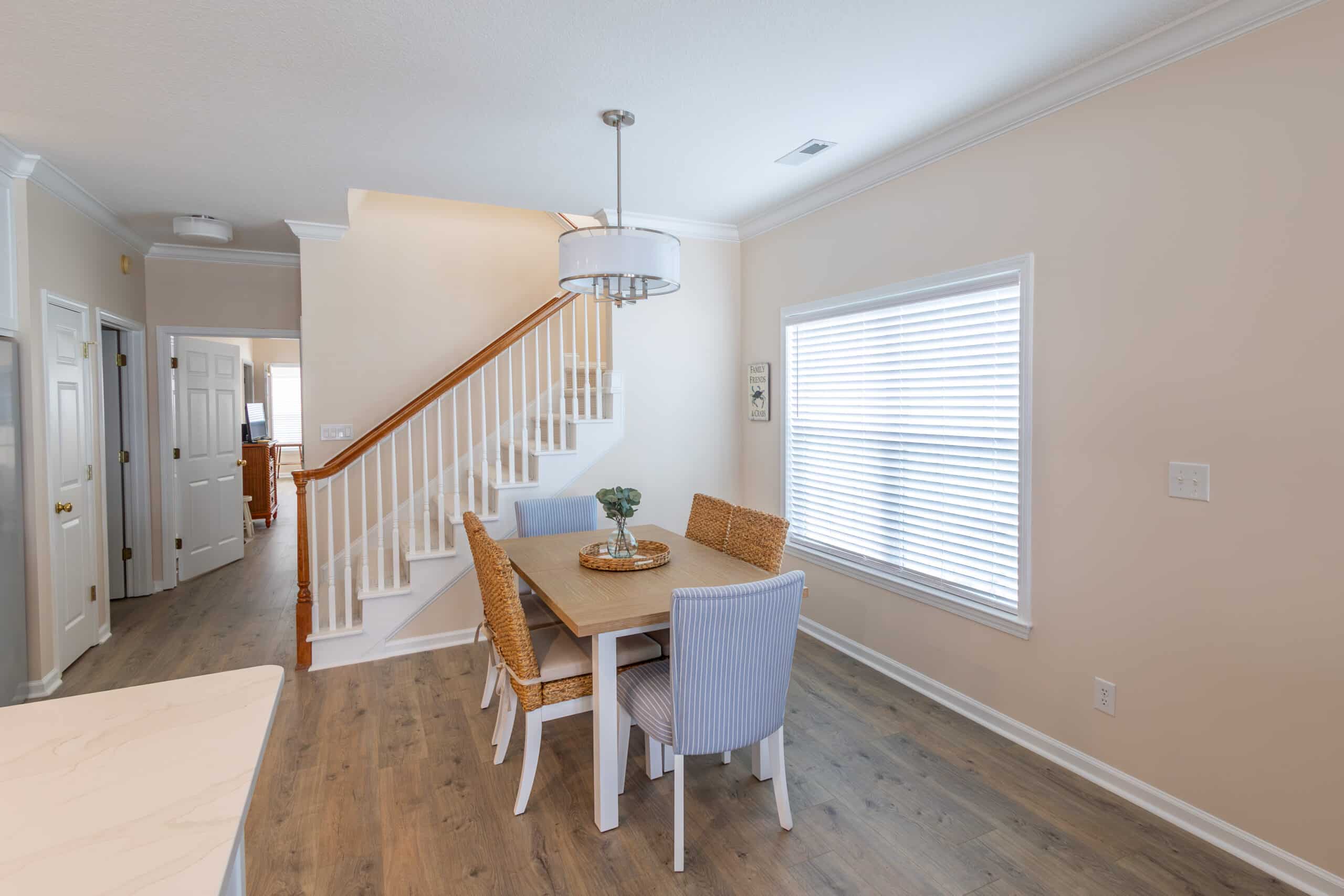
Pinterest will not solve this. Magazine photos will not either. The light in those shoots is not your light. Grand Strand sun behaves differently than studio light in a Brooklyn walk-up. Your floors, your ceiling height, and your window direction all change how a pairing reads. A paint color pairing that looks flawless online can land flat on your dining room wall.
There is a quieter problem under all of that. Homeowners often describe the second wall color step as the moment the project starts to feel risky. The Sherwin-Williams data backs this up: 28% of homeowners never test colors before committing to the can. A noticeable share of those people end up repainting. What looks like carelessness is usually fatigue. By the time the second color decision lands, the patience for another paint-store run is gone.
Good two-tone wall color ideas handle all of this with a single rule: undertone before anything else.
The Color Pairing Workshop Below Solves This
The workshop under this section runs every pairing through three checks that interior designers apply to real jobs. It confirms the undertones line up across both colors. It also targets a Light Reflectance Value spread of 15 to 30 points between the two colors. That range is the workshop’s algorithmic choice for keeping an accent wall color visible without visually splitting the room. It desaturates the output so the second color reads as livable paint, not a graphic-design swatch.
Your Second Color, Solved
Already have a main color in mind? Drop it in. We'll build four companion options using undertone science, not guesswork.
Four Pairings That Actually Work
Each option runs through the same filter: undertone check, LRV spread, saturation balance. Tap a strip to preview it below.
See It on a Wall
Corner view. Main color on the left, your selected pairing on the right, trim where the two meet.
Two walls meeting at an inside corner · Trim and ceiling in warm off-white
The Four Rules Behind These Pairings
Skip any of these and the math falls apart. Follow all four and the pairing tends to hold up on a real wall.
How Carroll Custom Coatings Closes the Gap Between Pairing and Paint
The workshop gets you a shortlist. A professional painter takes you from shortlist to final choice for your actual room.
Carroll Custom Coatings has been handling interior house painting in Surfside, SC, and the wider Grand Strand region with one priority: taking guesswork out of the process. Every project starts with a free estimate, and color questions are folded into that visit rather than billed as a separate appointment. A professional painter walks through your space and studies the direction of the sun, the ceiling height, the floor tone, and the trim you already own. Your shortlist is matched to what will read well in that specific room and to which accent wall color will hold up under your lighting.
The products behind the work matter as much as the color decision. Carroll Custom Coatings applies premium Sherwin-Williams paints, including the Emerald and Duration lines. These products are built for strong color retention. That means the second wall color you chose in the workshop looks much the same on day one and several years later. For interior projects, Carroll Custom Coatings uses low-VOC formulations, which matters in a coastal climate where humidity is a steady presence and will expose weaknesses in any lower-grade finish.
Every project includes a No-Surprise Guarantee. The quoted number is the one you pay. The plan is written out before any drop cloth comes out. Any change requires your sign-off before it happens.
If you are mid-decision on a paint color pairing for interior house painting in Surfside, SC, a single conversation with a professional painter can save you a week of indecision. It can also prevent a full repaint later.
Ready For Your Next Color Combo?
A professional painter notices variables that a screen cannot show. These include the sheen of your existing trim, the undertone of your floors, and the angle of afternoon light coming through your largest window. Those details change how any accent wall color reads once it is applied. Strong two-tone wall color ideas come from that kind of in-room thinking. You are not expected to figure this out alone.
Interior house painting in Surfside, SC, handled by a crew that understands coastal light, coastal moisture, and the homes along the Grand Strand means fewer surprises. It also means one less decision on your plate. Call 843-428-8322 today to book a free estimate with Carroll Custom Coatings and move your two-tone wall color ideas from a shortlist to a finished room.